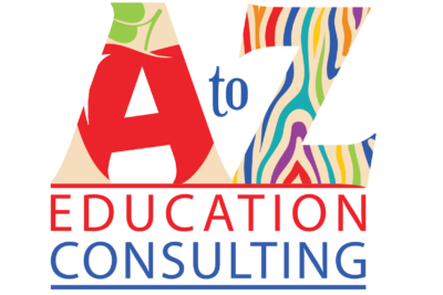
Graphic Design: Logo
The challenge here was to be taken seriously as a professional consulting firm, but it’s education, no not boring or dull. The name of the business plays off of the letters in Amstutz as well as conveying the range of services, from A to Z. Rachel wanted to play off of the A to Z and go with a literal interpretation. The final outcome is bright and colorful, yet not too preschool-looking. The client was exceedingly satisfied.


