Website
The Challenge
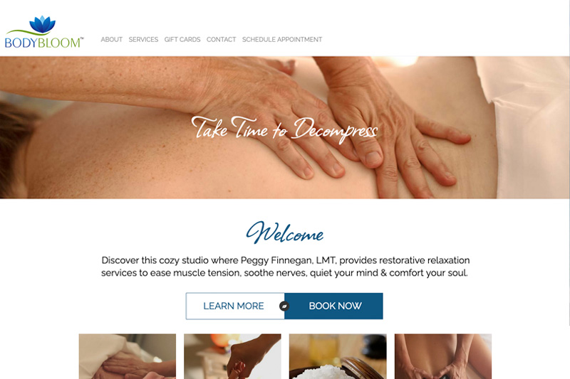
Peggy had a basic website from Vistaprint. She knew to take her business to the next level, she needed to put up a professional website.
The Solution
The imagery, colors, and fonts all contribute to promote a feeling of calm, relaxation, and chill — exactly what you want from a massage studio. The website provides basic information, with clear navigation, and a streamlined layout.
Special Features
Accordion
The site takes advantage of expand-and-contract sections to hide extraneous information. On the services page, website visitors will find a link, View Aromatherapy Choices. That information isn’t necessary when scanning the page, however, it’s accessible for those who wish to know what’s available to them. Also on that page, there’s a link, View Makes Scents Natural Spa Line Ingredient List. Not necessary information, but available to those who are interested, without bogging down the page. The use of accordion sections makes for a better user experience.
Speed Contact Bar
Situated at the tippiest top of the page, this colored bar definitely calls the visitors attention. She can put sales, promotions, or important notices there to easily convey short-term, important information.
Faveicon
The faveicon (Favorite Icon) which displays in the browser tab is a tiny replication of her lotus logo.
Learn More
Website Design
Your digital presence should always start with a great website. After all, there’s no point in sending traffic to a site that doesn’t convert.
Digital Marketing
An awesome website is a tragedy if no one knows about it. Digital marketing tells the world wide web that you exist and that your brand and website can solve problems.
Graphic Design
Everything that goes into making your digital presence look great. A clean, uniform, branded look makes your business look polished and professional, and inspires confidence in your ability to solve problems.


