Graphic Design: Logo
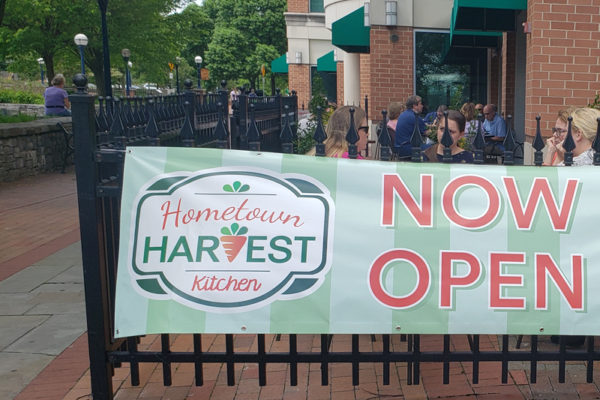
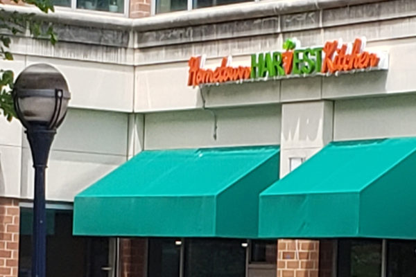
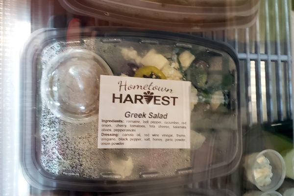
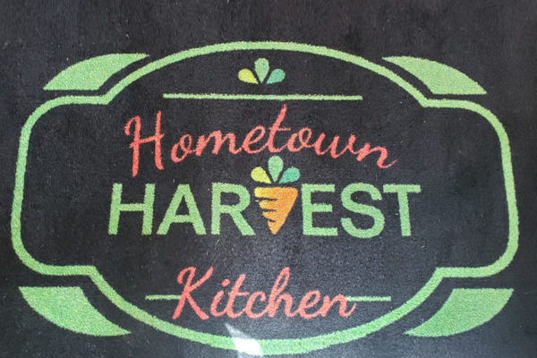
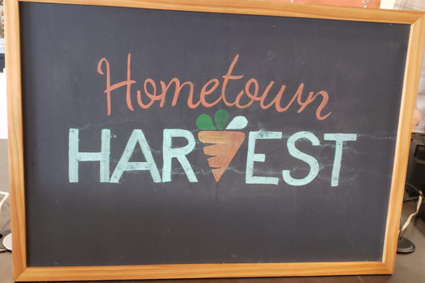
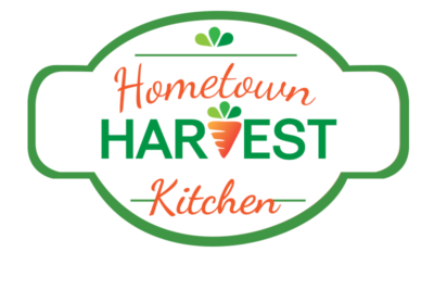
This new logo is actually a revision of the previous, as the business evolved. The original logo was simply text, Hometown Harvest, when Hometown Harvest was a farmers’ market delivery service. When HH merged with South Mountain Creamery they opted to set aside HH and manage all services under the South Mountain Creamery business name. When the business expanded into prepared meals—and they already had a great business name & domain—it made sense to resurrect Hometown Harvest…and add Kitchen, since now the business was making and selling prepared meals. The company took the business one step further this past Spring, when they opened their first brick-and-mortar, a cafeteria-style, family-friendly restaurant, serving local, fresh, sustainable foods, prepared by Hometown Harvest Kitchen.
The colors of the logo, the bright green & orange, evoke freshness and fun. The carrot in the center, in place of the V, represents everything the business stands for: farming, fresh, harvest, seasonal, local…all of that conveyed, hopefully, in a single graphic.
Website Design
Your digital presence should always start with a great website. After all, there’s no point in sending traffic to a site that doesn’t convert.
Digital Marketing
An awesome website is a tragedy if no one knows about it. Digital marketing tells the world wide web that you exist and that your brand and website can solve problems.
Graphic Design
Everything that goes into making your digital presence look great. A clean, uniform, branded look makes your business look polished and professional, and inspires confidence in your ability to solve problems.
