Website
The Challenge
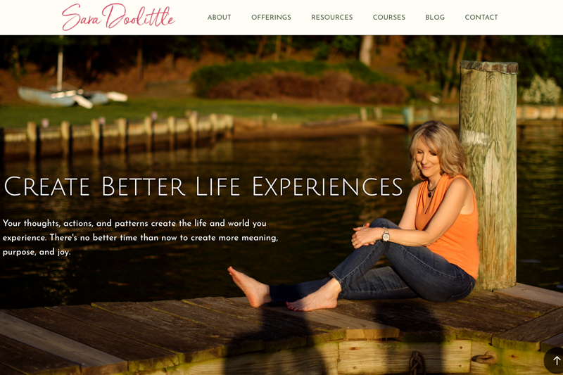
Sara’s website lacked a cohesive look to define her brand. It wasn’t initially evident what she was offering. The navigation options were confusing as to what one would find under each tab. And, her url is her name, and yet there was very little imagery of “Sara Doolittle” on the site. If the name of your site is YOU, I expect to see YOU, on the site. That’s not egotism, that’s branding.
The Solution
The entire website, pages, layout, headers, and images now incorporate a warm, earthy color scheme, evoking calm and nature. We organized her content into logical navigational tabs. We added plenty of photos of Sara herself; if your website is your domain name, one certainly expects to see photos of the subject.
Special Functionality
Email Capture
Sara has a special download available to those who sign up for her email newsletter. The incentive encourages those on the fence to submit their email, allowing her to build her email list faster. The emails are automatically uploaded to her Mailchimp master list.
Pinterest Pins
Images are pinnable to one’s Pinterest boards, allowing others to help spread her brand and message.
Blog Subscription
Rather than let WordPress take the lead on this, Sara’s blog subscribers are fed into Mailchimp. This allows her to send customized email to those who wish to be notified of recent blog posts. It also allows her to segment, and thus send targeted messages to blog subscribers, as well as include them in her master list.
Teachable
Sara’s Courses Page links to her Teachable site, which I customized to match the look of her website.


